
Roger Black: The Master Of Creative Magazine Design For Such Famed Titles As Rolling Stone, Esquire & Newsweek Talks About His Work And His Life – The Mr. Magazine™ Interview With Roger Black
October 4, 2016“The great advantage that magazines have that newspapers don’t really have, and the electronic media doesn’t have is that personal engagement, that one on one with reading and writing. Now, a blogger can get that; I read Jon Carroll; he used to be the editor of New West when I was doing that back in the 1980s. He was at the Chronicle in San Francisco for a long time and then retired and now he’s just doing a blog. And it’s fantastic. He wrote the best obituary that I’ve read in years only last week.
“I’m not trying to say that print has an innate advantage when it comes to reading and writing or a monopoly on it, but it is a very pleasant form of reading. It’s the whole thing of reading a book or a magazine under a tree or at the beach or on the airplane without power. And folding it and putting it in your bag and just wandering off. That is very pleasant.” Roger Black
 To call Roger Black a pioneer of magazine design seems an understatement; he’s a master. From Rolling Stone to Newsweek, and many great titles in between, he has left some decisive fingerprints on publications, so decisive in fact, that many who came after him made the decision to stick with the design of the master, at least in some fashion.
I first met Roger when I was doing a bit of consulting with Hearst Magazines and he was asked to design an up and coming new political title called George, the brainchild of the inimitable John Kennedy, Jr. In fact, I still have several of the prototype covers Roger designed and John Jr. was considering, when they decided to go in a different direction with the magazine.
Roger made an indelible mark on Rolling Stone as he came up with a typeface singularly for the magazine and gave it a typographical identity that still holds true to legacy today. He is an artisan of type and a creator of striking subtleties and bold statements. In an article written by Michael Wolff for New York Magazine, Michael writes: We (the general reader) expect magazines to look the way Roger makes them look. Roger has created a standard. Using a Macintosh, he has become the Windows of print. And while he did pioneer the use of computers in design, he does have a strong belief in the power of the print experience. So, Mr. Magazine™ agrees with Michael Wolff; Roger Black is definitely the Windows of print.
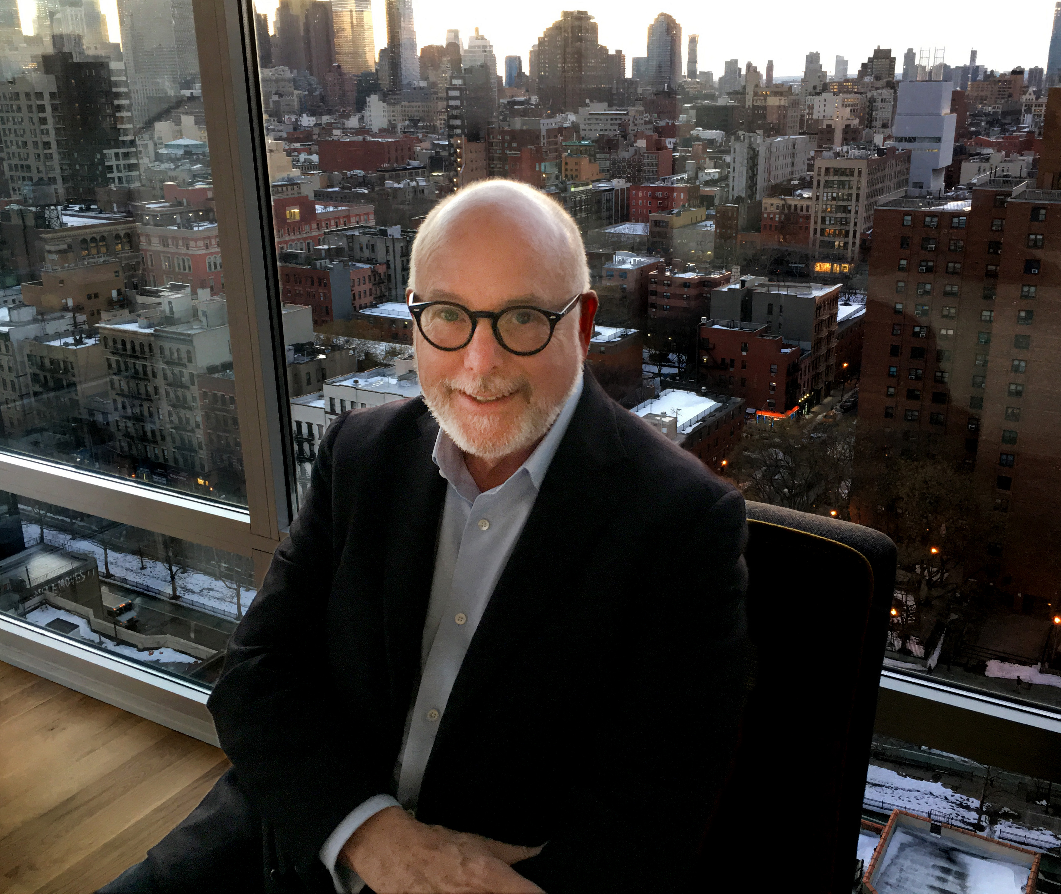
Today, Roger is far from retired, but instead, doing his own thing and enjoying life, while pondering the schematics of the business models. While a lover of print, he is still a connoisseur of digital, but not very pleased with what’s out there on the web today, except for a few exceptions. I spoke with Roger for an hour recently (via Skype while he was in Hong Kong) and we talked about his life in magazine design and his vision for the industry’s future. He posed some very interesting questions that will be addressed at an upcoming Poynter Institute panel of designers and editors. What if the industry’s current problems rests on the design aspect of the magazine or website as opposed to advertising or editorial? What can designers do to make the magazine experience more immersive?
These are just a few of the possible issues that will be addressed and discussed at the October Poynter event. But it’s a given that Roger Black will be the go-to designer for help with the solutions, because after all, when you can learn from the master, there is nothing better.
And now the Mr. Magazine™ interview with Roger Black.
But first the sound-bites:
On where he is in the world these days: I’m in Hong Kong. I’m actually just hanging out here. I have a lot of friends in Hong Kong. I was living here off and on for about three years. And then things starting happening in the U.S., so the last four months I’ve been in the States.
On the biggest changes in design over the years and how he’s adapted to those changes: The biggest change for me is magazines don’t have that team togetherness anymore. The departments have been cut to almost no one. There’s a lot of contractors and freelancers, and then in some magazines, like Time Inc. has the foundry. And there are these hubs that the newspapers have in quite a lot of the different groups and they’re combining the work of many publications. First that happened in production, then in design and now even in editorial. So, that kind of team is what I miss now.
On how he differentiates ink on paper and pixels on a screen in this digital age: Two things are happening right now. I think that the web design is probably going to change quite a lot in the next five years, probably more than it’s changed in the last twenty, because of the new tools. And also because of frustration with the way that publications have turned out on the web. So, my feeling is that the current design of webpages for publications is not any good. There are some important exceptions, but for the most part if you go to a magazine website or a newspaper website they have the same kind of setup they had from the beginning: a header, a main story, some kind of index, some blurbs, links, and now increasingly the random assault of ads in different sizes and different levels of animation and aggression. They pop over or they start twitching at you or there’s an auto start video.
On which of the many magazines that he designed or created in the United States was the most pleasant for him to work on: Actually, I have a hard time picking out a single one, because I never took a job that I didn’t think would be fun. And they usually were. I was wrong sometimes, but it’s very hard to judge all of these things. My reputation was set in those days in the beginning at Rolling Stone. And that was an amazing experience and I was there for four years, which is the longest I was at any one place. The only other publication that I was at for four years was The New York Times and that was moving around too. I was able to establish a typographic identity and that was part of the reason they hired me. Jann Wenner wanted to have a typeface, which was a fairly novel idea.
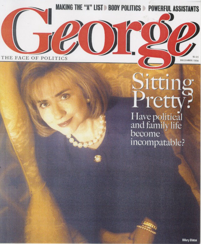
I can’t remember how John Kennedy showed up. The former picture editor at Rolling Stone and later on at Newsweek, Karen Mullarkey, was friends with him and she may have been the one to put him in touch with me. But it was one of those things where he had an enormous amount of enthusiasm and I think he could see that there was an opportunity for this to happen and that the country could go for a political magazine and his celebrity could help to carry it. He could open a lot of doors and sell ads, but the problem was that the editorial focus was never there. It didn’t know if it wanted to be a Wonk magazine, like The New Republic or Politico is today, or The Hill. Or if it wanted to be more pop; more Vanity Fair, to be a little glossy, more luxurious, more kind of celebrity-pitched.One of Roger Black’s prototype covers of George
On helping to launch Out magazine: Yes, and that was a similar time. We kind of did it out of the backend of Esquire, which was kind of fun. That was Michael Goff, who I have kept up with. He later became the editor of MSN, Microsoft Network, and I think did pretty well during the Microsoft boom. And he’s now doing something called Towle Road, which is a gay website that’s quite fun and it’s very political, and has a social side too; they do a big thing in the summer in Provincetown.
On when he fell in love with the square serif type: It was really early. I had a wonderful start at design. I recently went back to my 50th prep school reunion for my graduating class and I got to look through the stuff that I did then, because it turned out that I started trying to do design in school. And there was a wonderful designer named Robert Dothard, who was actually the first art director of Print magazine, which began as a fine printing journal, and who was advising the school on publications. He had owned his own printing company in Brattleboro and ended up becoming a magazine designer, and taught me how to set type. That’s where I got to actually slab-serif type!
On what keeps him up at night: (Laughs) Well, this interview is. (Laughs again) I’m worried about the business model, to tell you the truth. I have a home in Tampa Bay, Florida with my husband, Foster. We met at the Poynter Institute and we both rent offices from them. I got involved with Poynter on thinking about how you approach design in the current environment. So, we’re doing a program soon in New York that’s called The Poynter Digital Design Challenge. We’re asking five designers to try and figure out how to do digital publications.
And now the lightly edited transcript of the Mr. Magazine™ interview with Master Designer, Roger Black.
Samir Husni: Where in this vast world is Roger Black these days?
Roger Black: I’m in Hong Kong.
Samir Husni: And what’s happening in Hong Kong?
Roger Black: I’m actually just hanging out here. I have a lot of friends in Hong Kong. I was living here off and on for about three years. And then things starting happening in the U.S., so for the last four months I’ve been in the States.
I came to Hong Kong between type conferences. I went to the ATypI, which is the big one; the International Type Association, and it was in Warsaw this year. And I could have gone back to the States, but I knew that I would have to be in Bangkok soon, so I just decided to hang out in Hong Kong for a couple of weeks and catch up with folks.
Samir Husni: Through all of these years, you’ve launched a lot of new magazines and you’ve designed and redesigned a lot of magazines; how did you survive the evolution of design and have you enjoyed that progression?
Roger Black: There are two different things that have happened. There’s been an obviously big sea change, which it took us a while to understand just how big it was. I always say that people expect, or have the assumption, that things will be like they were when they got into this industry. That’s the norm.
I showed up essentially at the beginning of the art directing thing with magazines. I was able to announce that I was an art director and I was around 22-years-old. And people accepted it; there weren’t very many magazine or publication art directors around. Some of the biggest, most visual magazines like Life did not have an art director, and we’re talking about 1972. There were some magazines with art directors like Holiday or Town & Country, and the fashion magazines, like Esquire, but that was in the 1960s. In the ‘70s it was suddenly decided, pretty much as a result of the success of New York magazine, and to some degree Rolling Stone, that we had to have art directors or the magazines had to have art directors. So, it was a very good time to show up on the scene. I suppose it’s a good time to retire now. (Laughs) So, I hit the curve pretty nicely, No, I’m not retiring.
In any case, there have been big changes. One of the things that I was thinking about recently was the way Rolling Stone worked in the ‘70s. There was a picture posted on Facebook in a Facebook group of Rolling Stone alumni from 1977, which was the 10th year that they had moved to New York. And there’s a picture from the art department after a long day of deadline; it was the final closing in San Francisco. And everyone looked like they’d had a few consumables (Laughs), I’m not in the picture, but it was taken in my office. And what struck me about it was what a very happy little community; what a close group it was. How much everyone liked each other. There’s a certain amount of physical work in that little group.
The biggest change for me is magazines don’t have that team togetherness anymore. The departments have been cut to almost no one. There’s a lot of contractors and freelancers, and then in some magazines, like Time Inc. has the foundry. And there are these hubs that the newspapers have in quite a lot of the different groups and they’re combining the work of many publications. First that happened in production, then in design and now even in editorial.
So, that kind of team is what I miss now. When I went to Newsweek 10 years later, we had 100 people in art and photo to put out Newsweek. We had one department called “cover” and it had 11 people in it. I wandered by one day and I remember seeing the receptionist at her desk. The phone rang and she picked it up and said, “Good afternoon, cover.” (Laughs) And that stuck in my mind.
Newsweek had many, many covers. There were a lot of editions and with each one there were several different stories that were fighting for the cover, and probably several versions of each cover. So, it wasn’t like they didn’t have anything to do over there and work was much more tedious, with all the time it took to get type set and color separations were much more involved and the copy kept changing, things like that. It wasn’t a preposterous number of people doing that; Time Inc. had more. But it was a moment in time.
And it was fun. There were a lot of great people. I think the art departments were less structured than the editorial departments; they were smaller typically. And we were very young. I had already been the art director of The New York Times when I got to Newsweek. And I was still in my 30’s. And typically, my staff was younger than myself.
And now everyone is talking about the role of women in the media or technology and then it was mostly women. I don’t know if people remember that, but the art departments were almost an all-girl band in those days. And they were paid pretty well. I don’t think that we thought too much about the disparity between the men and women, but I think that Rolling Stone or Newsweek or any of the places that I worked at in the ‘70s, ‘80s and into the ‘90s; we were hiring the best people, we didn’t think about whether they were male or female. And women did a lot of the work. Managing editors of Rolling Stone were women, almost all of them. The photo editors were all women; it was interesting. And that I miss. I miss all of that community and the institutional aspects of it.
The problem was that it was institutional. The flip side is that everyone thought that this was going to go on forever, despite the fact that there had been enormous change in the ‘70s and ‘80s in technology. We went through the Scitex stuff and then the Macintoshes came in the late ‘80s and early ‘90s and everything changed. And it kept changing.
The way the photography was first, from Life magazine, for chartering airplanes to send photographs like Queen Elizabeth’s coronation back to New York and processing them in the air in order to try and get a color cover before anybody else. And it seemed all fine. We had giant satellite dishes that we were leasing out, sending things to remote plants; Newsweek in those days was 3 million in circulation. It was a big production. And we thought that was going to go on forever.
Now, today, the flip of that is we’re all essentially single actors, there are a few magazine art departments left, but for the most part you go into a publication and it’s one designer kind of doing all of the production too, maybe with an assistant and a photo person. And typically are freelancers doing a lot of it, freelancers in little studios doing a bunch of magazines at the same time. Or the bigger companies like Hearst or Condé Nast have increasingly brought all the redesigns in-house now. I haven’t done a redesign on a U.S. magazine in quite a while, the last was Scientific American. And that’s all a big change.
So, we’ve gone from a large enterprise to a very entrepreneurial, one-person studio for the most part. And we see this all over. The editors and the writers are often on their own too. And I think I miss the comradeship and the give-and-take, and also the fun of that.
At the same time, I left in 1987; Newsweek was my last job. I haven’t worked for anyone since. I took a job out here just as a way of getting to Hong Kong. It was an in-house redesign and I think everyone understood that I wasn’t going to stay there forever. But I got to Honk Kong and I enjoyed going around China and its regions. I’m now redesigning a paper that I already did once in Bangkok, The Nation, which is an English-language daily that has a TV channel and a website and all of the usual multimedia efforts.
Samir Husni: Speaking of multimedia; how do you juggle your creative thinking when you’re dealing with the ink on paper or pixels on a screen? Do you find that more challenging and more creative than when you were limited to one medium?
Roger Black: The main attraction is we now have video and animation that we didn’t have then. The reason that I went out on my own and left Newsweek after two years was that I was doing redesigns, or doing launches, and I was trying to set up a design system of, and the easiest way to describe it is just the type specifications; the little structures of headlines and subheads, pictures and captions and the other elements that you put together to design pages.
I wasn’t actually doing that many pages myself, part of that was that I had moved up so there were other staffers; I had a number of wonderful art directors who worked with me, first, at the publications, at Rolling Stone, New York or Esquire, but also in the studio. When I started a studio we immediately got work. And for 15 years or so, from ’87 until the end of the ‘90s, the highest that we ever got was 200 designers during the tech boom. We did a big rollup and it was called “Circle.com” and I was the chief creative officer. I should have known that that was the beginning of the end. (Laughs) Just the idea of calling yourself that. I actually joked about it in social media. I said that’s funny, because I always thought the chief creative officer was God. (Laughs again) That would be the only chief creative officer that I would recognize.
In any case, what we were doing was creating design systems or typography and art directing styles and putting together a stable of photographers and illustrators and commissioning typefaces, all of that stuff. And the typographical relationships were specified in stylebooks. So, when the web started, when you’re designing a website you’re not designing it page by page. You’re designing a set of rules, and increasingly it’s becoming more code and more algorithmic, or it’s interpreting CSS (Cascading Style Sheets) in a very interesting way, so that the webpages are very flexible and very responsive.
And for me, it was less of a shock to do that than it might have been for designers who think of themselves as artists and who start by drawing out the shape and the style of the page, it’s similar to pinning the paper to the drafting table or stretching the canvas and putting it on the easel. I never thought of that. I was always thinking about: with a 48-point head, I think I want a 16 on 18 point deck. It’s a little bolder. But if it gets too wide, I want this or that, you know? Those are the rules and that’s very webby.
Two things are happening right now. I think that the web design is probably going to change quite a lot in the next five years, probably more than it’s changed in the last twenty, because of the new tools. And also because of frustration with the way that publications have turned out on the web. So, my feeling is that the current design of webpages for publications is not any good. There are some important exceptions, but for the most part if you go to a magazine website or a newspaper website they have the same kind of setup they had from the beginning: a header, a main story, some kind of index, some blurbs, links, and now increasingly the random assault of ads in different sizes and different levels of animation and aggression. They pop over or they start twitching at you or there’s an auto start video.
The worst examples are the clickbait ads at the bottom of what seems like every page of very good publications, from Taboola or Outbreak or some place, which may or may not be related. You go to Facebook and you’re kind of amazed at how everything works together so well. But you go to most magazine websites and it doesn’t work well at all, it’s kind of an assault. So everyone is rather upset that the publication experience has been replaced by individuals arriving by some link to one story. They don’t look at the cover or the table of contents; they don’t page through the publication; they just dive right in and read a little bit of one story. And it’s shocking how little they do read. I don’t know if you followed the last report of session times that people were claiming and the idea that you would even have a two minute session time seems like a lot today, but you can’t read a story in two minutes, and they’re talking in the seconds.
So, I think that the digital publications, the web and most of their apps are at their nadir. I think they’re bound to get a lot better. Meanwhile we’re seeing an increase in small circulation-based business models for what people are calling “artisanal” magazines. These are extremely focused magazines; some of them relatively large like Monocle that are very laboriously produced; a lot of love goes into them. And they have very loyal readers and people love these magazines. And they find plenty of time to read all the way through an article or a whole magazine.
But none of them have done that well with their websites yet. But I think these magazines are showing the way. These small circulation-based publications have revenue models, which could be even crowdfunded, but they’re reader supported. It’s like NPR; it’s not advertising.
The big mistake that web publications made in 1995 was to imagine that they at last were going to be able to do the broadcast model, which was free space and free time, and you’d make the money back by building circulation. It never worked. No one ever got to the point where that model could work. Other people did, the Huffington’s of the world did OK, but not the old fashioned guys; not the guys from 6th Avenue.
And why is that? Well, that’s not a great model. (Laughs) In America, and I think it started with radio in the late ‘20s, print people were always kind of jealous of broadcast. So, by the ‘50s, Time and Life and those big publications, the Reader’s Digests, really were pushing circulation to get very big revenue from a relatively small cost per thousand page rate. And that worked as long as they were still mass media, but as soon as the mass media thing began to disappear, it stopped.
We see even fairly latecomers to the model like The Guardian in England now complaining that they’re not making any money. And I was always amazed that they thought that they could do it and the free model would work. (Laughs)
The old guys that are doing fine are people like The Economist; they have a very nice app, it works beautifully on my iPad. I read it every week. It’s the closest thing on the magazine side to Kindle. It’s page-based; you swipe the pages and it’s very easy to read. You can adjust the text. Now, they don’t have much in the way of layout, it’s like an old fashioned newspaper in some ways. But they have good covers and you read it.
And The New Yorker, using that kind of typical Condé Nast app model, is also quite good. I think when you have a publication on the newspaper side, the Financial Times, where you have a fairly lightly arted publication; it’s much easier to kind of go bookish on it. While we’ve been struggling, the book publishers almost went through the wringer. They were the first to start running for the hills. They were in a huge panic mode.
But in the last couple of years the decline flattened out somewhat. E-books began to flatten out too. And there are quite a few interesting book publishers that have come along and we find that there’s a very devoted group of readers who like to read books and they even like them in print. They want to read all of the way through and they have their favorite authors. I have a sister who reads a book a week still. She’s 84-years-old. And that’s great. I also know some 20-year-old’s also like to read, not quite as much as my sister, but they’re very busy.
When people talk about this session time, the supposed attention span problem of the millennials; I keep pointing to things like long-term sessions in video games and movies. We had a pretty bad summer when it came to movies, but there’s this wonderful thing that happens; people actually go to the movie theater. Now, we understand that the theater business is declining too, but meanwhile Amazon and Netflix and the rest have picked up quite a lot of the slack.
The films and the narrative-based long form is a very tantalizing point of fact for people in magazines. And we had been pushing away from that. When I was at Rolling Stone and you’d read magazines like Esquire or The New Yorker you’d find a 5,000 word, and the occasional 10,000 word, piece. Hunter Thompson would write two or three-parters that were heading toward 10,000 words for each part. Thinking that we knew what we were doing, we’ve chopped it into little, tiny tidbits of information and lots of pages. If you look at say, Cosmo, there’s hardly anything longer than 200 words throughout the whole thing. That’s a very engaging fun thing to have for a very short session, but at the same time, you go to the web and it’s all short pieces. With Facebook you’re just bathed in that, or Twitter or Instagram, or wherever. So, where do you go?
It’s not very effective in this market and I think that what’s going to happen is that these artisanal magazines are going to lead the way toward a different experience, where it’s very much like the old days. It will be more like the old journals; it’s actual writing and very personal.
The great advantage that magazines have that newspapers don’t really have, and the electronic media doesn’t have is that personal engagement, that one on one with reading and writing. Now, a blogger can get that; I read Jon Carroll; he used to be the editor of New West when I was doing that back in the ‘80s. He was at the Chronicle in San Francisco for a long time and then retired and now he’s just doing a blog. And it’s fantastic. He wrote the best obituary that I’ve read in years only last week.
I’m not trying to say that print has an innate advantage when it comes to reading and writing or a monopoly on it, but it is a very pleasant form of reading. It’s the whole thing of reading a book or a magazine under a tree or at the beach or on the airplane without power. And folding it and putting it in your bag and just wandering off. That is very pleasant.
Samir Husni: You’ve left a lot of footprints and handprints on a host of magazines in the United States. Which one was the most pleasant experience for you? Which one do you want the history books to read: Roger Black designed or created this magazine?
Roger Black: Actually, I have a hard time picking out a single one, because I never took a job that I didn’t think would be fun. And they usually were. I was wrong sometimes, but it’s very hard to judge all of these things.
My reputation was set in those days in the beginning at Rolling Stone. And that was an amazing experience and I was there for four years, which is the longest I was at any one place. The only other publication that I was at for four years was The New York Times and that was moving around too. I started at Rolling Stone as the assistant to Tony Lane who just passed away this year, and he was a pretty wild and amazing art director, typographer, much better art director than I, in terms of knowing photographers and working with illustrators, because he came from the record companies, where they had a lot of money and fat rolodexes, as we used to say.
At Rolling Stone there were a couple of things that happened. I was able to establish a typographic identity and that was part of the reason they hired me. Jann Wenner wanted to have a typeface, which was a fairly novel idea.
The only other magazine since 1929 that had its own typeface, as far as I know, was Avant Garde. Herb Lubalin had made a typeface for the magazine, which actually became the foundation for ITC, the company that he started with Aaron Burns. He figured out how to get that type as text, with the wonderful Ed Rondthaler from Photolettering. Avant Garde was just a display type and the type was set at Photolettering in New York, which was the best photo-type shop and the most expensive, $10 per word. (Laughs) It’s a concept that we can’t even understand anymore.
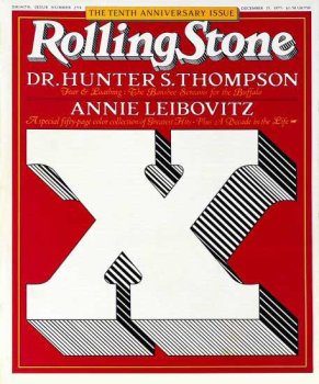
Anyway, that was interesting. So, Jann got me that opportunity and I pushed it as far as I could. I didn’t know exactly what typeface it should be, so we did a whole year of exploration and started putting things in the magazine, and that helped to identify what it was and by 1977, I started in ’75, we had the typeface drawn and it went into the famous 10th anniversary issue, with the big X on the cover, it had a red background with the white X that Jim Parkinson drew. That was the culmination of that design; we had all of the pieces together then.
I continued on there for another year and then I was succeeded by Mary Shanahan. So, the amazing thing for me was that by trying to come up with a look and feel that was based on the history of the magazine and contributed that, but pushed it a lot farther, we were able to set a model and a style that has persisted until today. So, it’s been 40 years. It’s pretty amazing. There have been interruptions, there have been times it seemed out of date and Jann wanted to change art directors or they kind of cleaned the decks and started over again. But then another art director would come along and restore it. (Laughs)
The first time that happened was when Fred Woodward, who is the great art director now at GQ, he brought back the 1977 format for the front and the back of the book. And when I got that copy, I’ve always been a subscriber, I called Fred up and asked him was it a copy he did just for me. (Laughs) Or do they all look like this? It seemed amazing.
And then it changed again. They threw out the type; they had a couple of art directors after Fred, who had different ideas, and Jann encouraged that; you can’t keep doing the same thing always. And when Joe Hutchinson, the current art director came in, and that’s been nearly 10 years, he restored it again. And if you look at Rolling Stone covers today, they bear an uncanny resemblance to what we did 40 years ago.
Now it’s a much more challenging situation, but there’s an identity there. The great magazines hold on. Time magazine has held on to its look and feel. Walter Bernard did a big rethink of that in 1977 and had a big change, but it was still Time.
When I did Esquire in the early ‘90s, my big challenge was to make it look like Esquire. One of the things when we design a new magazine is people who come across it and don’t know how old it is, they should think that it’s been there for a while; it’s established and has always looked that way. A magazine should have a natural look.
When I was at Smart magazine, one of the things that I learned was, and that was the beginning of the downsizing, I had a particularly important scale change, because I had come from Newsweek, where we had a fleet of blue Skyline cars waiting for us to take us home at night. (Laughs) The reason why Smart only lasted 13 issues was it was never funded. Hearst would put $5 million toward a launch, getting it to break even, and they would give it a few years. But we didn’t have a few years. And we had some crazy people on the publishing side. But it was fun. We had a really good time.
I had a great time at Rolling Stone; a pretty good time at Newsweek. Maynard Parker was there and Rick Smith, who I just did a project with, he’s retired, but he’s doing the Pinkerton Foundation, which is a very nice New York City charity group.
Samir Husni: Talking about experiences; I have the cover that you designed with Hillary Clinton when you were doing the prototype for George magazine.
Roger Black: Oh my; I forgot about that. (Laughs)
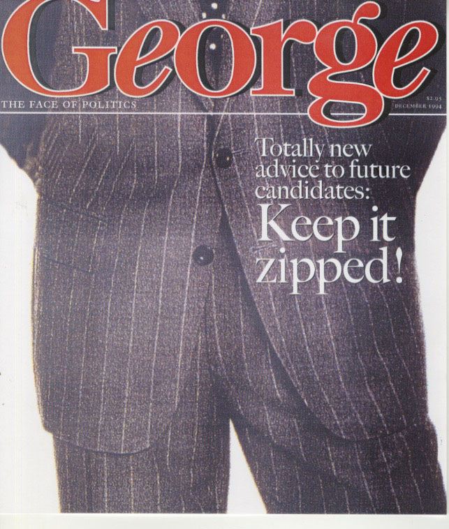
One of Roger Black’s prototype covers of George
Roger Black: Well, it was very interesting. I was at Esquire in those days. My deal at Hearst was that I had to do Esquire as part of my consulting thing and then I would move around and work with other magazines. We started Smart Money and I did some redesigns of several other magazines. And I also did my own stuff at that time, like Foreign Affairs that I designed and several others.
I can’t remember how John Kennedy showed up. The former picture editor at Rolling Stone and later on at Newsweek, Karen Mullarkey, was friends with him and she may have been the one to put him in touch with me. But it was one of those things where he had an enormous amount of enthusiasm and I think he could see that there was an opportunity for this to happen and that the country could go for a political magazine and his celebrity could help to carry it. He could open a lot of doors and sell ads, but the problem was that the editorial focus was never there. It didn’t know if it wanted to be a Wonk magazine, like The New Republic or Politico is today, or The Hill. Or if it wanted to be more pop; more Vanity Fair, to be a little glossy, more luxurious, more kind of celebrity-pitched.

The actual first issue of George… needless to say it was not designed by Roger Black.
But the editors wanted it a little more technical, the party politics and all that. So, that prototype was junked as being too New Republic; too serious and boring. And the magazine that they put out was much more Vanity Fair-like and it had the George Lois covers, which didn’t ultimately work.
Samir Husni: You’re also credited with helping and launching Out magazine.
Roger Black: Yes, and that was a similar time. We kind of did it out of the backend of Esquire, which was kind of fun. That was Michael Goff, who I have kept up with. He later became the editor of MSN, Microsoft Network, and I think did pretty well during the Microsoft boom. And he’s now doing something called Towle Road, which is a gay website that’s quite fun and it’s very political, and has a social side too; they do a big thing in the summer in Provincetown.
He was working for me as a kind of editorial manager/assistant; a sort of staff editor. I always liked to have an editor on staff because it turned the tables on them, because they were reporting to the art director and it was kind of fun. He was a really good one and he helped me write a book. It was called Desktop Design Power, the publisher named it, but it was about desktop publishing design in that same era, and he really wrote it. He was the ghostwriter. We were very good friends.
He showed up at Banana Republic, at Trips magazine, which was an ill-fated, one issue magazine, which was also incredibly fun. I know I have the proofs of the second issue someplace. I’m going through my archives now for the first time ever.
Goff had this idea to do some kind of gay publication. And this was right at the time that the AIDS epidemic was beginning to be understood and there was a lot of consciousness in the gay community. It was changing and becoming much more serious and we had Out Week.
I was going back to my 25th prep school reunion. And I met one of my best friends from school who was at The Boston Globe, Bob Hardman, and he was out and gay. Out Week had just folded and he asked me at that event what was going to replace Out Week, and I said that’s funny because I had this friend Michael Goff who was working on just such a thing. And he asked me to put him in touch with Michael.
So, Hardman helped to start it. He put some money in and helped them to figure it out. Under that regime it didn’t last all that long. Eventually it was sold, but it was really quite an amazing thing. I helped on the design; there were several other designers that worked on it. I got credit for it, but it was really Michael Goff who did it.
There was this woman named Sarah Pettit who was a great editor and who died fairly young. She figured out how to do a gay and lesbian magazine, which was probably an impossible idea. But it worked, I think.
Samir Husni: When did you fall in love with the square serif type?
Roger Black: It was really early. I had a wonderful start at design. I recently went back to my 50th prep school reunion for my graduating class and I got to look through the stuff that I did then, because it turned out that I started trying to do design in school. And there was a wonderful designer named Robert Dothard, who was actually the first art director of Print magazine, which began as a fine printing journal, and who was advising the school on publications. He had owned his own printing company in Brattleboro and ended up becoming a magazine designer, and taught me how to set type. That’s where I got to actually slab-serif type!
There was a magazine called Vermont Life in the ‘70s, and it was a very nice magazine. He did that and then a number of school publications and he was working with Deerfield, which wasn’t that far away. Deerfield, where I went to school, is almost a suburb of Springfield.
Dothard was in Brattleboro and he did the school printing. Deerfield Academy had a famous headmaster named Frank Boyden; he was the one who got Bruce Barton to do the school’s fundraising. Bruce Barton wrote a famous book about fundraising and a series of letters, model letters about fundraising. He was the founder of Batten, Barton Durston & Osborn; he was also a genius. He did the first publications for the school and they were beautifully done, like classical American fine printing.
And Dothard was aware of that and tried to keep that, so everything the school printed had to be seen by Dothard. So, that was how I met him; I was doing the student activity extracurricular kind of thing that was called American Studies Group. We were doing an art show of a New England artist and I was writing and editing and putting the show together with a bunch of people, members of the group, and I was told that if we printed anything Dothard had to be involved.
So, he did this wonderful thing of letting me think I was designing this catalog, and it came out beautifully. It was really the first book that I ever designed, the first publication, and I didn’t design it, of course. I couldn’t have. But he made me understand what the steps were to make all of those decisions. Then he offered me a summer job, what we’d call today an internship, but he called it an apprenticeship. And he taught me how to set type and I got to work on some books and magazines, and it was that composite era; we were still setting metal type. So, I learned that whole production system.
And from his old printing shop, he had a collection of wood type that included some slab serifs and I just thought they were fantastic, because wood type is something that even a child can set. But he also had some beautiful Monotype that had been cast as single letters and the classics type from the English revival in the 1920s, Centaur and Bembo. I loved the combination of any of these 19th century typefaces, and these classical revivals. Dothard thought I was out of my mind and told me that I couldn’t use those together. (Laughs) If you use a 19th century slab serif, Egyptian we call it; you have to use a 19th century text face.
And that was actually the basis for my Rolling Stone work. When I went to college, which was the next step, because this was the year before I went to college that I had this internship, I discovered that there was this wonderful type shop in Chicago called Ryder, and a friend of mine pointed out this typeface called Egiziano that they were using, and I fell in love with it and it’s still on my business cards. If people ask me my favorite typeface, I always say Egiziano. (Laughs)
Samir Husni: My typical last question; what keeps you up at night?
Roger Black: (Laughs) Well, this interview is. (Laughs again) I’m worried about the business model, to tell you the truth. I have a home in Tampa Bay, Florida with my husband, Foster. We met at the Poynter Institute and we both rent offices from them. I got involved with Poynter on thinking about how you approach design in the current environment. So, we’re doing a program soon in New York that’s called The Poynter Digital Design Challenge. We’re asking five designers to try and figure out how to do digital publications.
And as I was saying at the beginning of this conversation, I don’t think we’ve figured it out. I think we’ve done a lot of really bad websites and a lot of really bad apps. And they’re not working. I mentioned a few that are exceptions, but in large part, they’re not sustainable in their current form.
I’m not the one who is going to figure out the new business model, and I don’t think it’s going to be easy; although we talked a bit about what I think are the roots of it, which is it’s going to have to be reader-supported.
But what if you step away from those issues and ask what would we do if we thought that design was the problem? What if we imagined that design could solve the problem? Could we make a publication that’s more compelling, more immersive and more fun, one that’s more long-form, more sustainable, in terms of reader/writer involvement? How do you do that?
We’re asking some fairly well-known and successful designers with different backgrounds and different reputations to think about that. We’re doing a two-day session on October 17th and 18th at Columbia. The first session will be another group of pundits, and what I call pundits are experts that are fairly well-known, practiced editors and one designer, who are going to set up the problem. I’ll do a little introduction, listing all of the worst-practices and best-practices that I can see. And they’re all going to say what they want; we haven’t talked about that. It’s very interesting what people come up with about millennials or about anything at all.
It might be kind of surprising to see what they think the problems are; they’re not necessarily the obvious, it’s not the typeface. It’s going to leak over the parameters of just design. What we’re going to do is adjourn for a couple of months and then in January we’re going to reconvene. The designers are each going to do a little presentation of sketches; it could be a prototype or code, just whatever they can come up with, and what they’re solution would be. And all of this will be published and made public.
And I think that’s part of the conversation that has to happen. We’ve been making way too many assumptions that a website has to look like this or that; we have to have as many ads on a page as we possibly can. The assumption is that we’re trapped in this article-based-like the app Texture, they even list articles. Their email newsletter reads “recommended articles.” But no, let’s talk about the whole magazine, not just select articles. And it’s supposed to be an app where you read magazines! This assumption that we’ve lost the entire publication; that we’re all just wire services now, is wrong. I don’t think it’s going to work. We’ve dismembered the publication without thinking it all the way through. I think that you can still do it.
Now, I don’t have the example. I tried one a few years ago called Treesaver, where we did a Kindle-like magazine that was page-based, using very simple html code. A few people picked it up, but it didn’t go very far. And then you have Texture, and it’s really just captured PDF’s. Just look at Adobe and their Digital Publishing System; that was going to be the answer. We had that Fast Company thing to come out a couple of years ago and that was very interesting. Then the publishers seemed to just forget about it and to say goodbye.
We’ve seen these so-called artisanal magazines, these little Kickstarter publications that are showing up, are also showing the way. On the art side, there are some very interesting things. There had been a lot of interesting digital experiments, some of them more on the aggregation side. Medium is a pretty amazing thing, but it’s not a publication. What’s odd is that Facebook and Twitter have become the publications. And with Facebook’s amazing data management or heuristics, or whatever you want to call it, everybody’s Facebook experience is a little different. One of the things that I noticed recently is that mood swings happen with my cohorts on Facebook. They got very wound up during the debates recently and I found myself posting an article from the Smithsonian and it had an illustration, a picture of a cat mummy from the British Museum, and it was about the DNA history of cats; where do cats come from? It turned out that they’d been with us a lot longer than we’d thought and some were Viking cats. The Vikings distributed cats or moved them around; they would travel with them on the ships and go all over the world.
That was amazing stuff and everyone was so happy to have cats after Hillary and Trump. (Laughs) And you see that happening on Facebook; the moods change. Everyone gets serious or they want relief. There’s a lot of poignant stuff. It’s very magazine-y and it’s very personal. But it is quite random and eventually I think you’re going to get tired of it. We see that the millennials have already moved out.
People are looking for a direct, personal connection; they’re looking for affirmation of the things that they’re interested in, their pursuits and their loves in their lives. And it could be that they’re just interested in GoPro and high-tech stuff. Drones maybe; I just don’t know. But fine, let them have a magazine for it. (Laughs) And if you do it great, they’ll be very happy with it. But I don’t think we’re doing it great. We have to stop worrying about and blaming Steve Jobs and Mark Zuckerberg and everyone else, and start thinking about the fact that maybe it’s our fault. What can we do to turn this around? Maybe it won’t work, but we have to try. And that’s what I want to do, and what keeps me up at night.
Samir Husni: Thank you.


Leave a comment